Kitchen Paint Colors: Creating Ambiance
Selecting the perfect shade for your walls isn't just about aesthetics—it's about crafting an environment that resonates with your daily life. The right color can transform a room from merely functional to truly inspirational, influencing everything from your morning mood to evening relaxation. Let me share some insights I've gathered from interior designers and homeowners alike about making these crucial decisions.
Warm hues like golden yellows or terracotta oranges naturally create welcoming spaces, perfect for gathering areas where conversation flows. In contrast, serene blues and sage greens work wonders in spaces meant for unwinding. An often overlooked tip? Test your chosen colors at different times of day—what looks vibrant under morning light might feel entirely different by lamplight.
Considering the Room's Function and Style
Your kitchen's purpose should drive your color choices. While some prefer energizing citrus tones to stimulate appetites, others opt for soft beiges that keep the focus on culinary creations. Remember, the kitchen serves as both workspace and social hub—your palette should reflect this duality. I've seen stunning results when clients balance vibrant accent walls with neutral cabinetry.
Contemporary kitchens shine with monochromatic schemes, while farmhouse styles come alive with buttery yellows against distressed wood. Pro tip: Collect fabric swatches, tile samples, and paint chips together before deciding. Seeing how materials interact prevents costly mismatches down the road.
Factors to Consider When Making Your Choice
Beyond aesthetics, practical considerations matter immensely. North-facing rooms benefit from warm undertones to counter cool light, while south-facing spaces can handle cooler shades. For smaller kitchens, strategic use of light-reflective paints can create an airy illusion without expanding square footage.
The most successful projects I've witnessed always consider the existing architecture—highlighting crown molding with semi-gloss or using matte finishes to downplay imperfections. And never underestimate the power of samples: painting large poster boards lets you live with a color before committing.
Brightening Up Your Kitchen with Cool Tones
Cool Grays for a Modern Vibe
Modern kitchens achieve timeless elegance through layered gray tones. Designers often recommend pairing pale grays with textured backsplashes—the interplay of smooth cabinetry and rough stone creates visual interest. For a contemporary twist, try gray lower cabinets with floating white uppers.
Blues for a Tranquil Retreat
Coastal-inspired kitchens benefit tremendously from watery blues. A client recently transformed their cramped galley kitchen by using sky-blue upper cabinets with white subway tiles—the space instantly appeared larger and brighter. Consider navy islands for contrast against lighter perimeter cabinets.
Mint Greens for a Fresh Feel
This refreshing hue works particularly well in kitchens with natural wood elements. An unexpected pairing: mint green Shaker cabinets with brass hardware creates a fresh yet vintage aesthetic. For smaller spaces, limit green to the island or lower cabinets to avoid overwhelming the room.
Deep Teal for a Sophisticated Touch
Jewel-toned kitchens make dramatic statements when balanced properly. The key is contrast— pair deep teal cabinets with light quartz countertops and warm metallic accents. I recently saw this combination with unlacquered brass pulls that developed a beautiful patina over time.
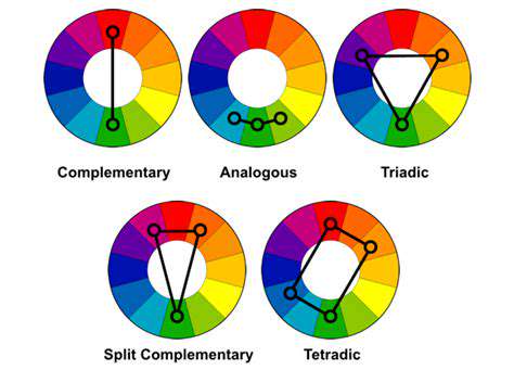
Beyond the Basics: Exploring Complementary Colors and Accents

Creating Cohesive Color Stories
Successful kitchens often use a 60-30-10 rule: 60% dominant color, 30% secondary, and 10% accent. This formula prevents visual chaos while allowing for personality. For instance, white walls (60%), gray cabinets (30%), and cobalt blue barstools (10%) create harmony with punch.
Texture as the Secret Weapon
Color interacts dramatically with surface treatments. A matte finish absorbs light for subtle elegance, while high-gloss reflects it for dramatic effect. Recently, a client used the same sage green in matte on walls and gloss on cabinets—the variation created depth without introducing new colors.
Evolution of Kitchen Palettes
Trends shift, but thoughtful design endures. Instead of chasing fads, consider how colors will age—both literally (sun exposure) and stylistically. Many designers recommend choosing cabinet colors you'll love for 10+ years, while playing with trendier shades in easily changed elements like backsplashes.